Background information
Apple, gold and the Middle Kingdom
by Dominik Bärlocher

Huawei is an excellent hardware manufacturer. Thanks to the finish of its products, users get the feeling they're holding more than just a pile of plastic. If it wasn't for the EMUI user interface, which has some rather remarkable imperfections. In today's Life Hack, I'm going to show you how to get a 'pure' Android experience.
Over the past few years, Huawei has gone from being a minor player on the Android scene to a market heavyweight. In 2012, the company, founded in 1987, managed to replace Ericsson as the world's largest electronics manufacturer. This success is due not only to the quality of its products, but also to ingenious marketing campaigns and a unique positioning on the Chinese domestic market.
It is clear from handling and examining Huawei phones in detail that designers at the Shenzhen, Guangdong-based firm have a strong appreciation of the designs of a famous Cupertino-based company, namely Apple. The Honor series, in particular, is clearly inspired by the Apple company.
The Apple inspirations are undeniable when using the device. Indeed, like many other Android device manufacturers, Huawei has designed a user interface specific to the Android operating system. This interface is called EMUI at Huawei and is present in version 3.1. It's the menu design that's most striking.

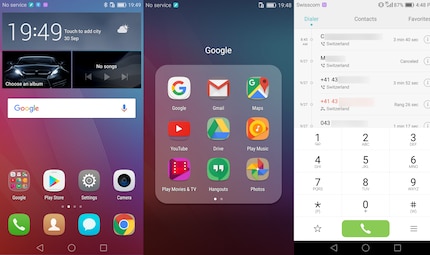
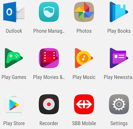
Icons are the biggest problem generated by this Apple-isation of Android - and the only one that can be considered an imperfection. Where the icons have irregular shapes in Android, they are always squares with rounded corners in Apple.
Huawei has remedied this by simply colouring in the often transparent background of Android icons. To all appearances, the square with the rounded corners would be filled with a slightly modified dominant colour of the non-transparent part of the icon. This is certainly not always a visual success.
Thankfully, Android is open source. This means that anyone can view and modify the operating system's source code. One such coder is called Adnan Ali, It was he who released an icon pack entitled PureIcons on the forum for resourceful Android developers xda-developers.
This icon pack does not interfere in any depth with the structure of the operating system, it simply uses a feature of the EMUI interface left open by Huawei. However, we accept no responsibility for any damage to your phone. It's customary, before you start, to back up all your photos and other important data.
Here we go:

PureIcons doesn't replace all the icons with new images, but it does make the user interface much nicer. The reason being that it's up to its developer, Ali, to replace each icon individually and, with some 2.4 million apps available in the Google Play Store, there are a multitude of them. Far too many for a philanthropic project.
Journalist. Author. Hacker. A storyteller searching for boundaries, secrets and taboos – putting the world to paper. Not because I can but because I can’t not.
Interesting facts about products, behind-the-scenes looks at manufacturers and deep-dives on interesting people.
Show all