Total flexibility, but a disappointing screen: the Wacom Cintiq Pro 17
With its new Pro series of graphics tablets with screen, Wacom seems to have thought of everything. Well, almost everything, because it's precisely the screen that has some weaknesses.
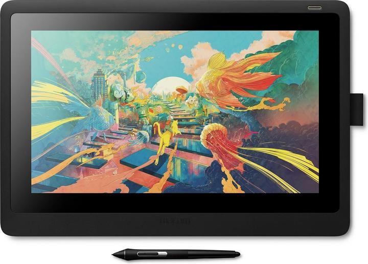
Wacom is adding three new models to its Cintiq Pro series of graphics tablets. As well as the 17.3-inch version I'm testing, you'll also find two 22-inch and 27-inch models. As well as a screen that offers a good grip for drawing and a feature-rich pen, the tablet offers a number of customisable buttons. But the Cintiq Pro 17 also takes up quite a bit of space and the screen has a few imperfections. I tested it with the optional stand from Wacom.
A product overview
The Cintiq Pro 17 from Wacom is a graphics tablet with a screen and immense customisation possibilities. Everyone has their own preferences when it comes to illustration and other creative work. Wacom offers great flexibility in this respect: the tablet has programmable buttons on the back and two different menus, also programmable, in the Wacom software.
Source: Michelle Brändle
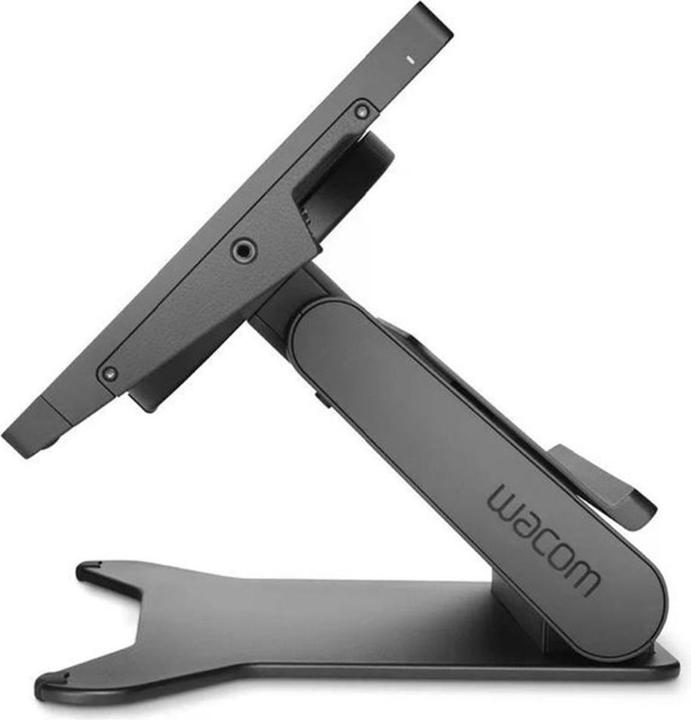
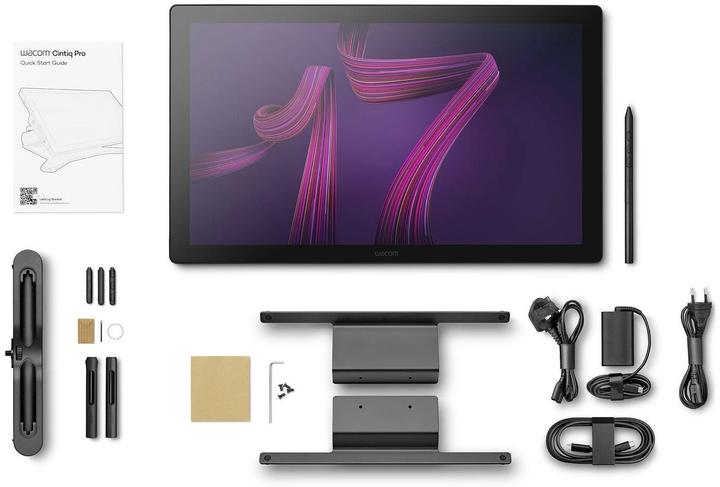
The accompanying stylus has three buttons and you can customise it with extra weights and sheaths. Finally, an additional metal foot lets you adjust the tablet to the height you want. So you can tilt it both horizontally and vertically. At first glance, the specifications look promising:
- Display: 4K resolution, 120 Hz, 86% Adobe RGB, 99% DCI-P3, Pantone Validated
certification.
HDR support, touch screen and stylus control
- Functions: 8 programmable express keys
- Ports: USB-C Displayport, USB-C Displayport, HDMI, miniDP
- Others: extendable frame with fixing nuts (for pen holder, keyboard, camera)
- Pro Pen 3 sensitivity: 8,192 levels of pressure sensitivity, 60° tilt detection
- Pen functions: 3 side buttons, customisation possible with weights or different handles, interchangeable tips included
A screen that's only half suitable for graphic designers
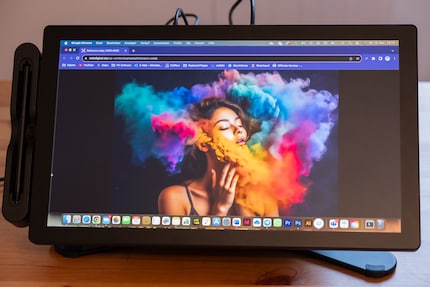
The screen of the Wacom Cintiq Pro 17 has a matt surface. For working with a stylus, this is certainly nothing new, but very pleasant. The 120 Hertz refresh rate is remarkable for smooth use. The 4K resolution is also optimal.
Besides the spec sheet, I test the display's performance using a ColorChecker Display Plus from Calibrite : My test unit offers 98.9% coverage of the DCI-P3 colour space, which is important for film production. However, for Adobe RGB, which is more important for graphic designers in the final printing phase, coverage is only 86.1%. By contrast, the sRGB colour space, commonly used for working and surfing the Internet, has 99.9% coverage. Not what I'd expect from a professional monitor for graphic designers. If you need ultra-precise colour adjustment for photography and graphics, this is extremely valuable. For illustrations, depending on the case, it's not as important.
Source: Michelle Brändle
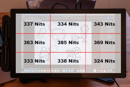
For full screen brightness, I measure 385 cd/m². That's good enough for working indoors. And it stops there. The tablet is quite large and heavy, and it also needs a power socket. In these conditions, you don't need more brightness. Depending on the lighting conditions in your home or studio, however, something extra would be more than welcome.
Source: Michelle Brändle
If I measure the uniformity of the screen, I notice a strong irregularity in brightness with a difference of up to 50 cd/m². For very dark subjects, this is noticeable to the naked eye. However, on lighter images, the difference is barely noticeable.
The static contrast of 1209:1 is decent, but nothing more. This means that the white parts of the image are around 1200 times brighter than the darker parts. Depending on what you're drawing or editing on the screen, a higher value would be handy. Or if you are visually impaired. In practice, this mediocre contrast doesn't bother me. In general, I tend to draw in colour on a white background and use bright colours. But for dark designs and subtle colour gradations, it's totally relevant.
Easy installation, but a rather heavy tablet
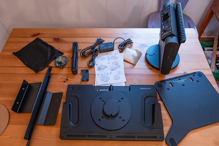
The tablet comes to me in a huge cardboard box. I'm afraid Wacom have sent me their entire range. It's just the Wacom Cintiq Pro 17 with a simple stand as well as a more sophisticated stand with rotation and tilt functions.
Source: Michelle Brändle
Source: Michelle Brändle
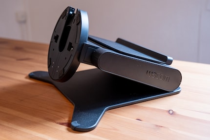
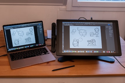
As I'm putting it all together using simple instructions, I'm surprised by how the different components look. It's not just the shelf that feels heavy and gives an impression of quality, it's the aluminium legs too. Everything feels very robust and durable. You won't have to worry about spilling anything while drawing. On the downside, the shelf takes up quite a bit of space. I have to clear my kitchen table to install it, which would be unthinkable at my workstation. On my desk, as well as the screen and the PC case, there's podcast equipment, speakers and other stuff.
Source: Michelle Brändle
Installing the Wacom Cintiq Pro 17 is simple, I connect the tablet to my MacBook via USB-C. The second USB-C cable goes from the tablet to my power socket via a connector. Finally, I download the driver and I'm done.
The design works perfectly, the buttons take some getting used to
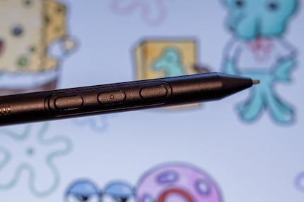
On the Wacom Cintiq Pro 17, the drawing is nice, the Wacom Pro Pen 3 is a little too light for me on delivery. Here, however, I can insert additional weights or, if I wish, place a thicker handle on the stylus.
Source: Michelle Brändle
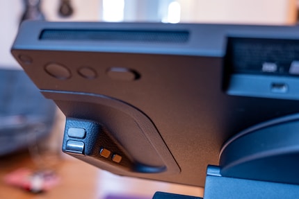
The adaptability doesn't just come down to the stylus, the tablet also offers a lot of freedom. Thanks to additional software installed with the driver, I can freely program each key, even with shortcuts for Adobe Photoshop, for example. The keys are all on the back. So it takes a little getting used to before you can use them blind. They feel just like a games controller and are just as much fun to press.
Source: Michelle Brändle
I use them to enlarge and reduce my canvas. And of course, to go straight to the express menu. The great thing about the buttons on the back is that they're on the left and right of the tablet. As a left-handed person, this allows me to program the right-hand buttons, for example.

Source: Michelle Brändle
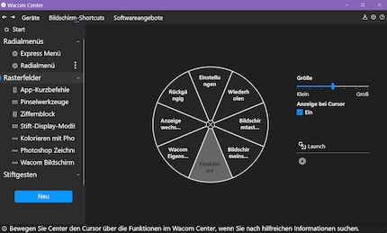
A searchable radial menu offers further options for all the functions that need to be within reach as quickly as possible. It's practical here too: if I call up the menu via a button on the back, it appears exactly where my cursor is every time. So I can select functions extremely quickly.
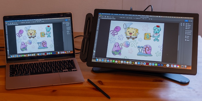
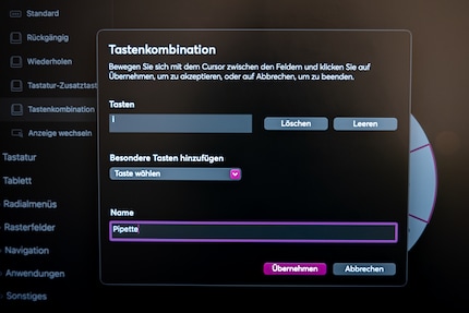
As I draw a few characters from Bikini Bottom, the town in SpongeBob SquarePants, in Photoshop, I quickly realise everything I need. For example, I like to use the same colour palette. So I create a shortcut command in the express menu for the eyedropper and another for the paintbrush, so that I can quickly switch from one to the other. On the stylus, I activate the eraser, as I'm used to doing with Procreate on the iPad. The two extra buttons are for going back and blurring colour gradients. If I don't want to use the touch function, there's a toggle switch on the back that turns the touch function on and off.
Source: Michelle Brändle
The stand offers additional flexibility. As I often change position when I'm drawing, I like being able to adjust the height and tilt. As a result, I stiffen up a lot less when drawing than I do in front of the iPad. I find the lateral tilt of the screen a little less interesting, as it's only 45 degrees. That's why I use the touch function to rotate the canvas. That way, I'm not limited by the angle.
The touch screen: not optimised for macOS
The touchscreen is great in itself. On my PC with Windows 11, it works well and smoothly. When testing with my MacBook Air equipped with the M1 chip, however, I notice a delay in response. This is precisely the case in Photoshop when I zoom in or out with two fingers. On a second try on a MacBook Pro equipped with an M1 chip, it's already much smoother. Be aware of this if you have a MacBook.
After asking Wacom, I was told that macOS is not optimised for smooth touch use. This is particularly noticeable in Photoshop. I find this rather a shame. If I'm spending that kind of money on an expensive device, I don't want to have to buy another computer.
Conclusion: a great drawing experience, but a mediocre screen
The Wacom Cintiq Pro 17 offers a lot of freedom. You can program all the buttons however you like. I also think the ability to add accessories using the side nuts is top notch. With the extra stand, you have even more flexibility.
The screen is large and nice for drawing on. However, the quality of the screen doesn't match the price: it's not evenly lit and should have more contrast. This didn't bother me in practice. Colour space coverage is accurate for sRGB and DCI-P3. It's a shame that Adobe RGB coverage, which is at least as important for a graphics tablet, is only 86%. I also don't like the fact that using the touchscreen is less fluid with my MacBook M1 than it is with Windows.
If you want to save a little more on price, I recommend the previous model. The Wacom Cintiq Pro 16 is admittedly a little smaller, but it also offers plenty of side-key flexibility and a good drawing feel on a medium-quality screen. But again, I find the price high.
If you don't fancy spending that much, there are two graphics tablets that are both very nice. On the one hand, the Wacom Cintiq 16 (without Pro), i.e. the lite version of my test device.
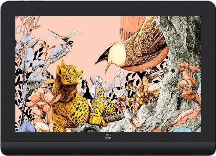
And XP-Pen's Artist Pro 16, which includes a separate remote control for shortcuts. I tested the latter in the 14-inch version and find it excellent value for money. AdobeRGB colour space coverage here is 97% and for DCI-P3 it's 99%. And I found it smoother to use with the MacBook Air.
In my world, Super Mario chases Stormtroopers with a unicorn and Harley Quinn mixes cocktails for Eddie and Peter at the beach bar. Wherever I can live out my creativity, my fingers tingle. Or maybe it's because nothing flows through my veins but chocolate, glitter and coffee.
