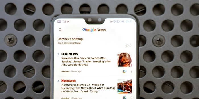
Google News: The filtered newsfeed without a filter bubble
Your news, no filter bubble, automatically transformed into a beautiful layout. The new Google News app promises a lot. It also delivers a lot, but there is a big "but".
Google can be really annoying sometimes. The search engine giant simply launches apps on the market and informs users that it has done so at the edge of the news flow. This was the case with Google News - also available for Apple iOS - an app that didn't deserve its shadowy existence.
So let's go big with Google News.
Your newsfeed and some search
Google News brings you news. In other words, the app shows you news from your subscribed news channels and aggregates other news from the Internet that might also be of interest to you based on your news. The app collects this in the "For You" tab.
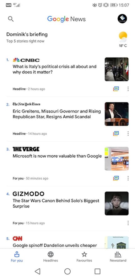
The design of the app adheres to Google's new design guidelines when it comes to Material Design. The Internet calls it "Material Design 2" because it breaks with many of the traditions of the first version. Fewer colours, more white space and fewer corners, essentially. Whilst this may seem bare at first, the design then makes a big difference. Instead of drawing attention to design elements - the red bar at the top of the YouTube app is terribly dominant - the content can shine.
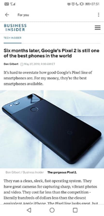
When you click on a story, Google News generates a view that matches the design of the app, regardless of whether the content-generating website wants it that way. If possible, this includes replacing the website font with a Google font with serifs. This makes reading the story quite pleasant and the reading flow is not broken, at least in the text, as over 95 per cent of all books on the planet are printed in a serif font. That's Garamond, by the way.
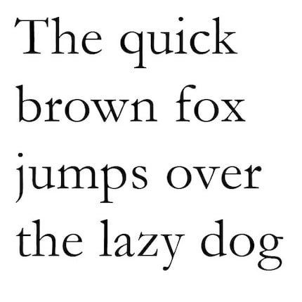
This is Garamond
Replacing the fonts and tearing out the content does not yet work smoothly everywhere. Many websites are simply shown in their mobile view, but in the wrapper of the Google News app. This means that the fonts and formatting remain intact. It would be nice if Google would work on this, because the standardised news view is appealing.
The solution to the problem of the filter bubble?
In the "Favourites" tab, you can search for your favourite news topics. Whether it's a news outlet like Vice or a person like strongman Eddie Hall.
.
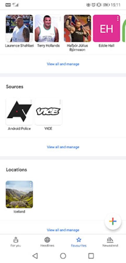
This is where the problem of the filter bubble first becomes apparent. The filter bubble describes a distortion of perception that only exists when you don't receive balanced news. In Switzerland, we have less of a problem with biased media, as the Billag protects us from a completely privatised media world. Nevertheless, no one can claim that the Weltwoche is politically aligned in exactly the same way as the WOZ.
This is not a problem in and of itself and media diversity, including in terms of political views, is extremely important for a democracy and for life in our world. It becomes problematic when social media is added. The pioneer here is Facebook, which is why I am using Facebook here as a representative of all social media channels.
Facebook wants you to spend as much time as possible on their page. Because each of these views is essentially there to collect data about you that is used to sell adverts. Therefore, Facebook doesn't want to annoy you and doesn't want to show you news that could annoy you. So if you believe that reptilians from the Hollow Earth are influencing the world by taking part in porn films and can't maintain their human camouflage, you'll find more and more automatically curated "news" on the topic on Facebook. But only with the perspective you represent.
This is how morons like anti-vaccinationists and flat-earth believers have gained massive momentum in recent years. Worse still, politicians like Donald Trump spout stupid things like "fake news" and users still believe it because their filter bubble repeats this nonsense as often as possible. Because at some point, you believe this shit.
Google News wants to clear this up. Under as many stories as possible, an icon is displayed that represents coloured papers laid on top of each other. If you click on it, you will be taken to the "Full Coverage" tab.

Full Coverage means that you will see all the news on the topic, not just the views you personally like. Sometimes the glorious decision of your favourite party is dismissed as stupidity or your favourite celebrity is slammed. Twitter is automatically read and indexed, YouTube and news sources you've never heard of
.
This is healthy. Even if you're upset about all the "left-wing drivel from the lying press", it's good to be confronted with it. Otherwise you can easily be led around by the nose by your own people. But I would have liked the full coverage feature to be more conspicuous and easier to access. Because as it stands now, you don't necessarily have to leave your filter bubble.
The big negative point
The app sounds pretty good so far. If you want, it gives you an all-round view and presents the news in a nice way. It also has a signal-to-noise ratio of one hundred to practically zero. The signal-to-noise measurement describes the ratio of desired information and background noise that is simply there but that nobody wants. I don't read all the articles that Google News suggests, but I have a rough overview of my topics every morning. I really like that.
I don't like the adverts so much. I don't like them at all. Google makes its money from advertising, and so do websites. If Google were to filter out the adverts, both the news medium writing the article and Google would lose money. Of course, nobody wants that, because no matter how well Google and co. mean us, they have to pay their bills somehow.
The result then looks like this:
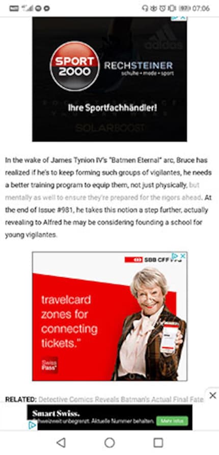
Let's take this apart in detail. On my Huawei P20 Pro, a screenshot is 2240 pixels high.
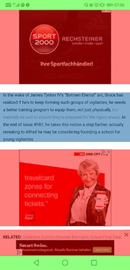
I have briefly highlighted advertising and navigation elements in the feed in colour. This allows the following analysis to be made
- Navigation: 204 pixels → 9.11% of the screen
- Advertisement: 1470 pixels → 65.63% of the screen
- White space: 156 pixels → 6.96% of the screen
- Content: 410 pixels → 18.30% of the screen
This layout is not just an isolated case. I like SBB, I like sport and Salt, but not in my news. I want information in my news. Because that ruins the signal-to-noise ratio of the whole app. Since I understand the idea of advertising, I would like to have - just thinking arbitrarily - about 40 to 50 per cent content per screen. If I have to search for content because it's drowning in adverts, then that's complete nonsense, both from an advertising and a news perspective. Because I don't want to spend any more time on the site or with the app. On the contrary: I look for an ad blocker.
Where the feed contains practically only information and also offers divergent opinions, the article you end up reading is sometimes essentially advertising, briefly interrupted in places by information. That's rubbish.
Despite everything, I like Google News. The app aggregates news from topics that interest me. As this is all done automatically, I don't have any duplicates or any entertaining rubbish like on the social news aggregation platform Reddit or other comparable services. Only the adverts are annoying.
Journalist. Author. Hacker. A storyteller searching for boundaries, secrets and taboos – putting the world to paper. Not because I can but because I can’t not.
Interesting facts about products, behind-the-scenes looks at manufacturers and deep-dives on interesting people.
Show all