
Samsung One UI: the first passable Android Distro
Samsung’s new user interface has many perks. Let’s take a look back into a history of horrible interfaces with sexually charged names from South Korea.
Android manufacturers enjoy ruining versions of their products by changing something just so they can say they did. Complaining about this is the bread and butter of the Android community. Not without reason either. Huawei’s Emui is a disaster, but nothing compared to the raging unusable dumpster fire that is Xiaomi’s Miui. Samsung’s hasn’t without fault either. Until now. Because Samsung’s One UI, as they call it, is their first user interface I would call «okay».
High praise, I know.
Let’s take a look at an Android Distro that actually has a reason for its existence.
The following elements
Samsung has a long history with broken UI’s: during the days of Samsung TouchWiz, in fact, the South Korean manufacturer was one of the best in the business when it came to breaking whatever they touched. Completely messed up colour choices for menu elements wasn’t the only thing that made users angry.
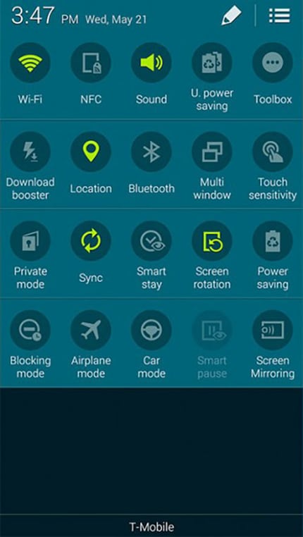
Source: androidheadlines.com
TouchWiz also marked the start of two eras: the era of «let’s change something just to do it, not to improve it» and the era of unfortunate sexually charged names for their UI. In case you still don’t get it: «Whizz» means urine. So logically: TouchWiz... touch urine. Haha. Hilarious. This is one of the reasons why Marvel superhero James Sanders doesn’t call himself The Whizzer anymore, but Speed Demon. By the way.
TouchWiz was subsequently buried. Thankfully. It was followed by a release that was 95% stock Android – the default software version that Google produces. This version was called Samsung Experience.
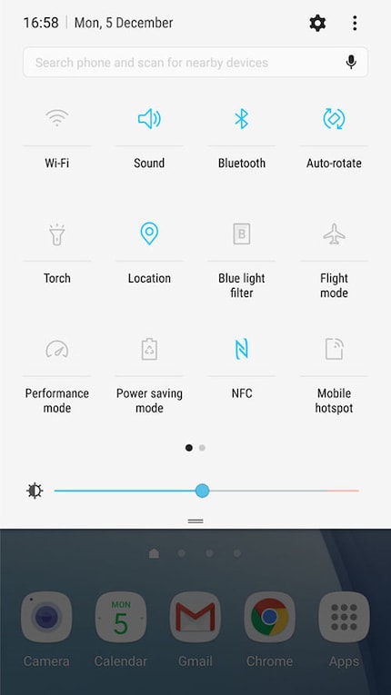
Source: androidcentral.com
The name in itself isn’t sexual, only in combination with another feature out at the time: Samsung Dex. Dex stands for Desktop Experience. I wonder what would happen if the same applied to Samsung Experience? Let’s take the first letter of the first word and add «ex» as in «Experience». Well would you look at that. Sex. How did no one notice this? Or did they notice it and blindly hope no one else would?
Back to One UI
One UI has ushered in a third, non-sexual era. An era that gets most things right with few mistakes. Even as a lifelong complainer, I’m willing to admit that it does more things right than wrong. In some aspects, One UI is even better than stock Android. Because Samsung understood the first rule of large screens:
- You look at things at the top of the screen.
- You press things at the bottom of the screen.
Here’s what this looks like:
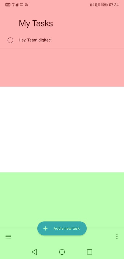
Any control elements should be located in the green area or – if need be – in the white area, but certainly not in the red area.
This is why, with One UI, all screen elements have been moved down as far as possible. The top kindly displays information or white space. White space is a term used in graphics and describes parts of a page or layout that are intentionally left empty. They serve to simplify and help you instinctively understand the layout without getting overwhelmed. Side margins and paragraph formatting are good examples of white space. White space doesn’t have to be white.
This becomes vital when Samsung One UI’s dark mode is enabled. System-wide dark mode is amazing, isn’t it? It even uses Amoled, the power-saving colour #000000. What a great extra. In this category, Huawei’s Emui is still ahead, but they are markedly worse when it comes to white space.
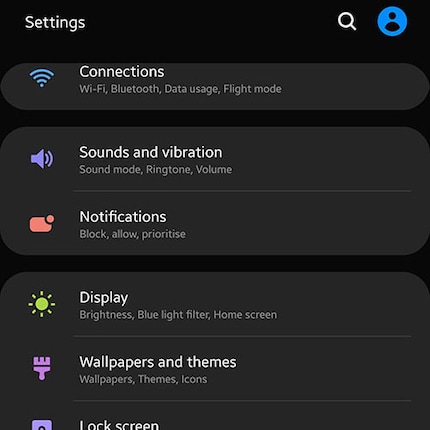
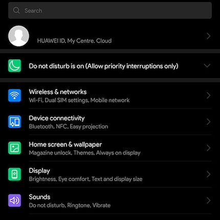
Both elements are large, clear and simple. Especially the shortcuts in the notification tray are remarkable. Notifications themselves can be changed to take up less space by going to Settings → Notifications. Regrettably, you still can’t completely remove annoying notifications such as «Do Not Disturb is Enabled». Neither on Emui nor One UI. What a pity. I know Do Not Disturb is on, don’t I? I’ve got that big icon up there to tell me already.
It’s big fault: the home screen
One UI isn’t all amazing, however. It’s biggest weakness, its home screen, is another reason to get Nova Launcher – or any launcher, in fact.
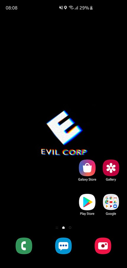
Samsung hasn’t really changed anything. Some widgets were moved around bizarrely, but that’s it. The layout can be adjusted, but not to an extent where using the home screen seems viable or usable. Or modern after 2010. Shame.
This makes One UI plus Nova Launcher a solid choice.
Old gestures
Samsung added gesture controls to One UI. In a way. In essence, you can switch the three navigation buttons ◁, ◯ and ▢ to «full screen gestures» under Settings → Display → Navigation Bar. Unlike stock Android, One UI didn’t switch to a slightly changed functionality. One UI’s gestures are just swipe-activated buttons. So, if you swipe from bottom to top on the left side of the screen, you go back. In the middle: home screen. On the right: all apps.
This works surprisingly well, looking much better than the little button stuck to the bottom of the screen on Android P, Google’s newest release.
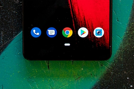
It seems as if One UI’s gesture commands were thought through until the end, unlike Google’s. Isn’t the whole point of gesture controls to remove operating icons? This concept is called Zero UI, with the goal of making a UI completely invisible and instinctively usable. Making knobs unnecessary.
Other nice features
One UI doesn’t just come with improved graphics. It has many small functions that make using your phone that much simpler. An example, not conclusive but a good example, is Bluetooth.
Depending on which Android Distro you have, Bluetooth can be quite arduous. You connect your phone to a speaker. Your phone then transfers over and plays anything that would come out of its built-in speakers through the connected one. If you want to call someone, you need to disconnect from the speaker to even do this. Either that, or you can share your call with anyone in earshot of the speaker. That works as well.
One UI uses the integrated Samsung App Smart Things to simply do this in the notification tray. It creates a switch where you can choose where to output sound.
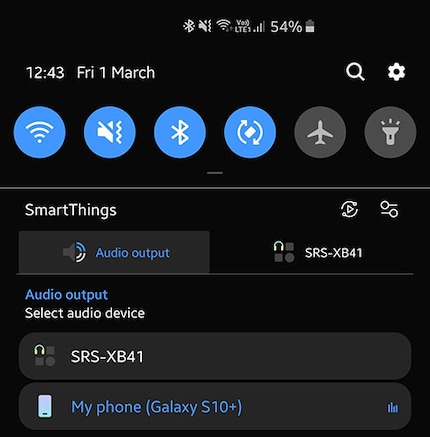
It’s a simple explanation. The switch is basically a copy of the one you’ll find under Bluetooth → SRS-XB41. When you’ve arrived on that page, Huawei Emu requires a long press and a second click on a little gear. Other Distros do this differently, mind you. Samsung nails this.
OEM Roms are fun this way, aren’t they?
In short: One UI is actually pretty neat. I like the layout, the graphics, all of that. The home screen remains antiquated. Samsung Experience had the same problem.
That’s it. I’ll try swiping left and right for a while.
Journalist. Author. Hacker. A storyteller searching for boundaries, secrets and taboos – putting the world to paper. Not because I can but because I can’t not.