Android Pie: a quick look at the Android revolution
The new Android version doesn’t feature the three-button navigation bar. You’ll have to readjust – whether you like it or not. Let’s take a quick look at the new navigation feature and identify the winners and the losers of this update.
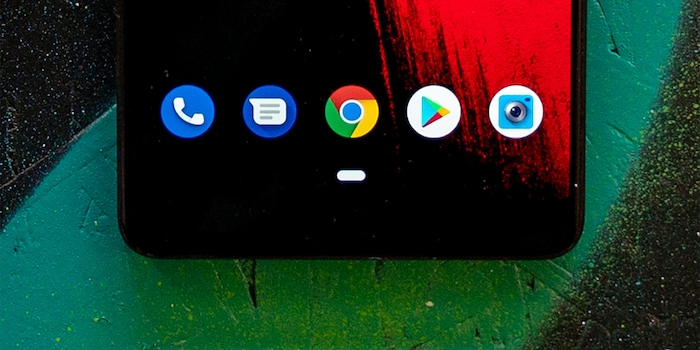
The three buttons at the bottom of your Android screen are no longer. Android Pie has no triangle, circle and square any more; just a dash. That’s all. Why? Google recognised that one-handed navigation had become difficult with Android. A solution was needed.
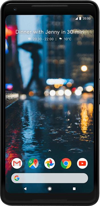
And this is what it looks like:

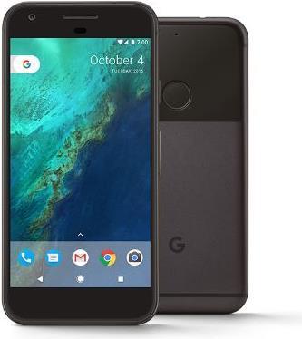
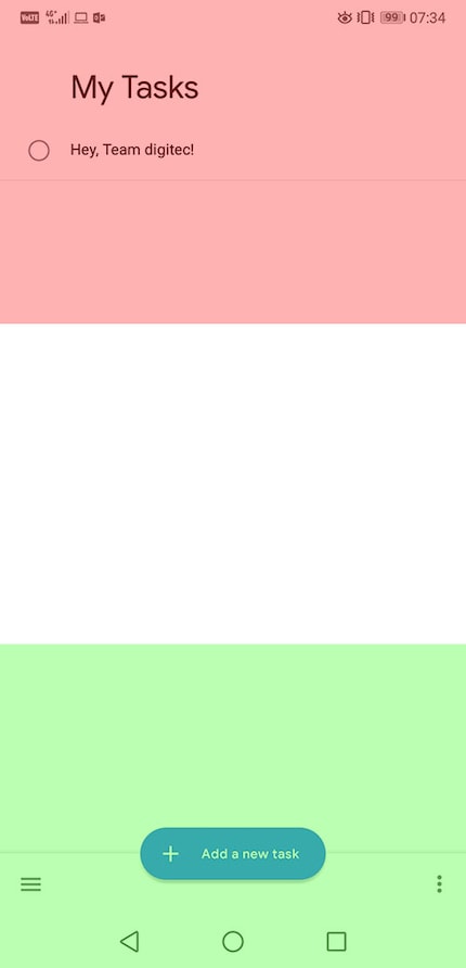
As a reminder, this is what it used to look like:

The old navigation bar has three buttons that are operated by tapping on them. The new navigation bar is all about swiping.
Swiping instead of tapping
The new navigation bar looks simpler and doesn't rely on specific contact points anymore, but on movements. It’s not about tipping anymore, it’s all about swiping.
Swipe up and you’ll see all open apps. This view lets you switch between all active apps, similar to the previous «All apps» screen, which you could reach by tapping the square button on your phone. What's also new is that the apps are now arranged horizontally, not vertically.
In the «All apps» screen or the app itself, there’s an arrow next to the navigation symbol. Tap this arrow or swipe the bottom corner to switch between apps. Within an app, the arrow functions as «Back» button.

This makes sense, as Google reacts to an observation related to large phones: The upper half of the screen is used to consume media – in exceptional cases for controls. All control elements should be located in the lower third of the screen.
With this, a big step in the direction of one-handed operation is already completed, as there's no longer a need to change your grip or relocate your hand to get to the top part of the screen.
Who loses out? The app «Drawer»
With the new swiping mechanism and the simplified access to the «All apps» screen, there's one element that loses out: the app «Drawer». The menu you used to reach by tapping the button in the middle of the menu bar in old Android versions is quite likely to become sidelined in future Android versions.

Why? Because «Drawer» has essentially become a garbage dump for bloatware and apps that you never need. But there would have been a simple solution to make «Drawer» useful again without having to eliminate it completely: Making it possible for users to hide apps. If there’s no way to uninstall annoying apps such as Huawei’s HiCare or booking.com, there should at least be a way to make sure they don’t appear.
In some ways, the «All apps» screen takes care of this. You're using the app? It appears in your «All apps» screen. If you're using the app, you may want to use it again. The user interface has been made a bit more visually appealing.
Where to hide the apps
You can still find the apps that can be hidden under Nova Launcher and other third-party launchers. Most standard launchers can't do that. But that's exactly where the option of arranging app icons freely would be desirable. This is where the big screen comes in again.
«Drawer» Die App follows this pattern: from top left to bottom right. This might be visually appealing, but it's useless if you have a large smartphone.
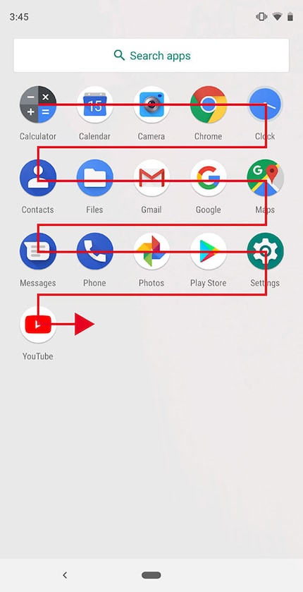
However, it would make more sense to arrange apps radially from the bottom right corner – or from the bottom left for the left-handed ten percent of the population.
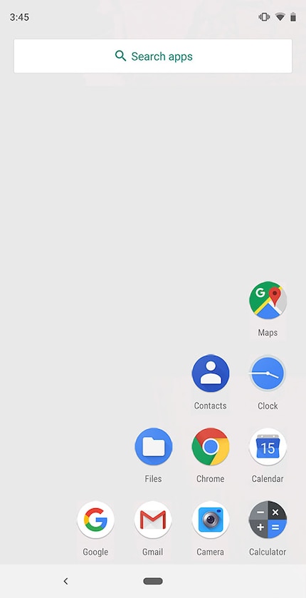
But this problem is obsolete, as the apps are now arranged by the machine. Android is in charge of arranging your apps in the exact place where they’re easiest for you to access.
Android Pie is now available on all Google pixel devices. The features in this article have been tested on the Essential PH-1. Other brands that are part of the first wave of upgrades are:
- Oppo
- Vivo
- Sony
- OnePlus
All devices with Android One are also included.
Journalist. Author. Hacker. A storyteller searching for boundaries, secrets and taboos – putting the world to paper. Not because I can but because I can’t not.
