
News + Trends
Reach for the stars – astrophotography
by Denny Phan

Who needs colour photos when these in black and white actually convey a much better sense of the atmosphere? It is particularly during the cold winter months that it is perfectly normal for people to perceive the world around them as grey. Why not take advantage of this and creatively apply this to your photography?
Fortunately, I am still in sunny Australia. Like so many other things here in "down under", the seasons are a little upside down. Celebrating Christmas at 35 degrees and in flip flops is a little unfamiliar to me. However, I still remember last year's winter exactly. After all, it was also the reason for my hasty escape to the warm land of surfers and kangaroos! As I'm in this nostalgic mood, I would like to give you a short introduction to the topic of black-and-white photography.
Less is more! This is the first rule that applies to many situations in life and even more so to black-and-white photography (the only time it doesn't apply is to chocolate and the acquisition of lenses)! In my opinion, monochrome photos are most powerful when they are reduced to the bare essentials.
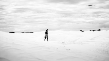
My second suggestion is to make monochrome photography a priority. That means that you need to be consciously searching for black-and-white motifs before your shoot. In the age of Instagram and mobile phone filters, it happens far too often that black-and-white photography is only an afterthought used after a photo has been taken. By doing that you are missing the chance to influence the desired direction of your black-and-white photo right at the time of taking it. A fitting metaphor here would be buying the ingredients for your grandmother's secret recipe for spaghetti bolognese at Migros and then realising at home that you forgot the tomato sauce. Going back out into the cold isn't an option, so you use the slightly stale ketchup that's still in the refrigerator for the sake of convenience. Maybe it will work with a huge load of spices, but it surely isn't the best solution, right? 😀
If you're not very experienced in this area, it always helps to have tomato sauce at home and to activate the black-and-white mode on your camera. By doing this, you can look at the world without colour directly in the preview on your screen.
Without colour, we forego a strong and multifaceted means of design. However, this is absolutely no reason to feel restricted and to give up on using your camera. Quite the opposite. Without the distracting effect of colours, you have the opportunity to concentrate on the essentials.
In my opinion, the following five means of design have an even greater impact in monochrome! Furthermore, a better understanding of these concepts will also have a positive effect on your colour photos.
Lines and shapes
Whether straight, angular, circular or wavy – lines and shapes will come into full effect in black-and-white photography. More than anywhere else. Look for this in your motif selection and photo composition and accentuate their features. To this end, I recommend working with the rule of thirds and the golden ratio.
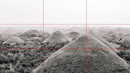
The rule of thirds says that you should divide a photo into nine boxes of equal size and align the focal points on the lines.
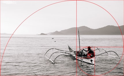
With the golden ratio, you theoretically divide the picture seven times (to infinity) in a ratio of 61.8% to 38.2%. In practice it is advisable to align your motif on the two largest sections and to be generous in the picture to allow for more freedom in post-editing. (Tip: While in cropping mode in Adobe Lightroom, you can have the golden spirals superimposed on the photo by using the "O" key. Rotate them with "SHIFT + O".
Patterns
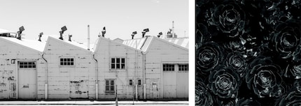
Patterns and repeating shapes are often lost in colour photos, especially when they are subtle constellations. in black and white, however, they stand out even more and will shine as a visual concept with a good composition.

Contrast
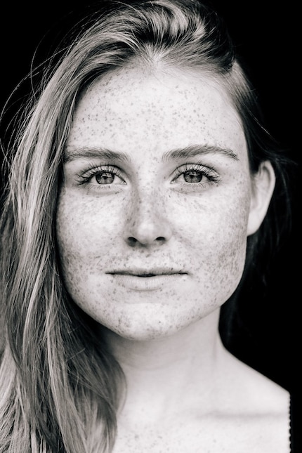
Contrast is a central and particularly powerful design element in black-and-white photography. As the photographic elements and motifs no longer differ in terms of their colours, you need contrast to emphasise your central motif.
Especially in portraits, you can increase the contrast a little more in monochrome photography than in colour photographs. This leads to a dramatic look and highlights prominent features of your model.
Work with lower depth of field
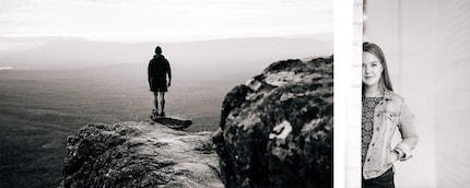
A lower depth of field leads the eye of the viewer to the most important aspects in the photo. In black-and-white photos this becomes even clearer.
Through targeted use of blurriness (such as the rock on the right side of the example photo), you can give the picture a nice three-dimensionality.
High-key & low-key
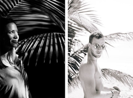
Low-key and high-key photography are two design styles that are commonly used in black-and-white photography. Generally speaking, both styles are used to capture a more gloomy (low-key) or cheerful (high-key) mood.
In low-key photography, strong contrasts as well as black and grey tones are dominant features. The photo is either strongly underexposed or the light source is reduced to a minimum. Additionally, the light source is mostly positioned nexte to the model or motif. By doing this, you achieve a dramatic mood with highlighted silhouettes.
High-key photography, in turn, is low in contrasts and dominated by soft light.
The biggest mistake that you can make when post-editing black-and-white photos is to slide the saturation level adjuster to 0. By doing so, you get a picture which has had the colour and life sucked out of it. The result in most cases is dull and flat. Hardly anything that you would want to hang on the wall.
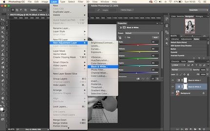
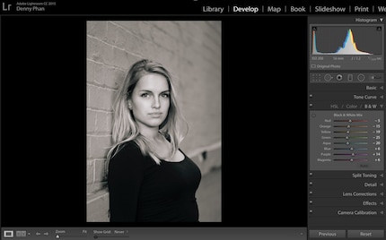
The right way to do it is with a software that allows you to control the individual colour channels and to optimise them for the final black-and-white photo. You're probably thinking, why should I adjust the colour channels when we're talking about having no colours in the photo? Well, with a channel mixer you can get more out of your black-and-white photos. You can optimise the individual colour ranges in terms of their shades of grey. By doing this, you get a monochrome picture with more depth, contrast and character.
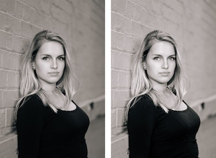
In the photo on the left, saturation was reduced in Lightroom. The photo on the right was edited with a channel mixer.
Photoshop Tutorial:
Lightroom Tutorial:
If you are not planning on going to great lengths in post-editing your photos, you should switch your camera to black-and-white mode from the start. Most cameras have this mode and already have a few pre-programmed optimisations that help you achieve an attractive look.
A camera in one hand, an airline ticket in the other. That's what I call a perfect situation.
Find out more about me and my photography on <a href="https://www.instagram.com/35waves/" target="_blank">Instagram</a> or on my <a href="https://www.35waves.com/" target="_blank">website</a>
Interesting facts about products, behind-the-scenes looks at manufacturers and deep-dives on interesting people.
Show all