New Chrome icon
Chrome has a new icon. What do you think of it?
- Finally! It looks great.25%
- It's horrible. I want the 2008 icon back!14%
- New icon? Where?61%
The competition has ended.

Google Chrome has got a new icon. It’s a cleanup, not a redesign, says Bern-based graphic designer Mariana Hurtado.
Google Chrome is getting a new icon in 2022. It’s a dead ringer for the old one. In a Twitter thread, Google designer Elvin Hu explains the work that went into the new crest. Swiss graphic designer Mariana Hurtado has also taken a look at the logo. Her opinion: «This is less of a redesign and more of a cleanup. There are a lot of small but good changes in there.»
The evolution of the Google Chrome icon can be summed up as the removal of complexity. In the course of the thirteen years that Chrome has been around, the icon has changed from a kind of glass ball to a stylised circle. The most recent iteration of the spherical circle was published in 2014 and is set to be replaced in 2022.
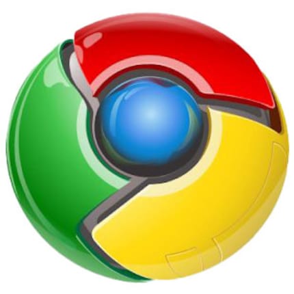
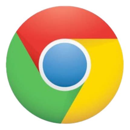
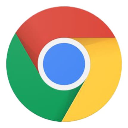
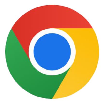
Two things immediately stand out:
But there’s more to it. Elvin Hu writes: «We simplified the main brand icon by removing the shadows, refining the proportions and brightening the colors, to align with Google's more modern brand expression.»
The most obvious change is that the blue centre is bigger. A comparison with drawn-in lines nicely illustrates this.
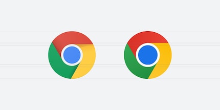
«More balanced proportions create a feeling of accessibility,» Mariana says. An icon must convey a lot of information – program name, function, content and so on – in very few pixels. In addition, an icon must not be perceived as a distraction on the screen. «Your eyes should glide over an icon, but at the same time understand it within a split second,» explains the graphic designer. In order for the message of an icon to go directly from eye to brain, the viewer shouldn’t get hung up on it and think, «Oof, that’s weird!» – not even subconsciously.
She describes the larger blue circle in the centre as «unobtrusive – as it should be».
That was the obvious part. The colours, on the other hand, are much more subtle. The new logo isn’t simply made up of flat shades, but a very subtle gradient. Red transitions from Red 600 (HEX E53935) to Red 500 (HEX F44336). Yellow 600 (HEX FDD835) transitions to Yellow 500 (HEX FFEB3B). And Green 600 (HEX 43A047) transitions to Green 500 (HEX 4CAF50).
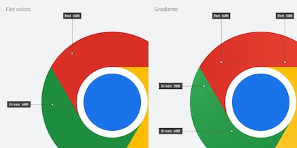
The transition is so subtle that even in an enlarged view of the gradients, you barely notice a difference.
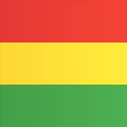
The colour gradients become more apparent when not actually displayed as colour gradients.
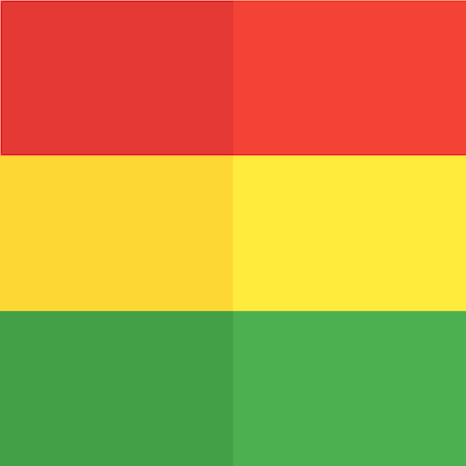
«Shadows and gradients are trends that come and go,» says Mariana, «but from a user experience perspective, high contrast levels are more accessible to users whose eyesight isn’t perfect.» She goes on to explain that this only applies to user interfaces, not to the usability of the app itself; a feature may still be cumbersome, even if it can be clearly perceived by everyone.
Why are there colour gradients if they’re nigh invisible? «I was wondering the same thing,» Mariana says. «From a professional standpoint, it makes no sense.»
Mariana laughs. She says she wouldn’t have noticed that the logo is new on her screen, be it on a smartphone or PC. «So, Elvin and his team did a good job. I see only Chrome – and not gradients or blue circles.»
Looking closely, she sees the small differences and realises that this is part of a larger effort by Google. The search giant’s products are meant to feel the same on each platform; use the same colours and speak the same visual language. «When you see it, you should immediately know and feel that it’s Google.»
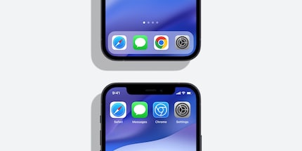
Elvin Hu and his team didn’t settle for just a logo: the Chrome icon on Windows is different from the one on Mac. «We want the icons to feel recognizably Chrome, but also well crafted for each OS,» he writes on Twitter.
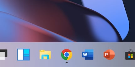
In stark contrast to the logo on Windows 11, it’s been given a trompe-l’oeil effect on macOS and looks like a tangible, three-dimensional object.
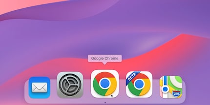
The goal is that the Google browser feel native within each operating system.
In his Twitter Thread, Elvin provides further insight into his work. The designer shows a design that the team discarded. «We explored introducing more negative space,» he writes alongside the following picture:
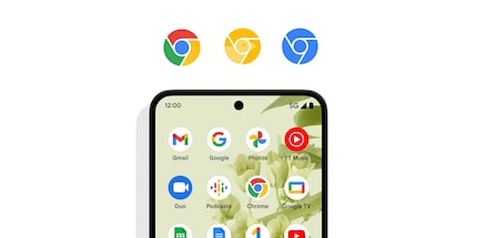
However, the designers quickly cast aside this idea. The outline it required shrunk the coloured elements of the icon; «And made it more difficult to recognize, especially next to other Google apps.» What’s being introduced now is designed to live up to the standards set by the size of modern-day displays.
Some other Google icons are changing as well: if you have a beta or developer version of Chrome installed, the icon will get a banner that says either «Beta» or «Dev». This was previously difficult to read when the icon was scaled down. Now, «Beta» will be replaced by a «B», and «Dev» by a «D».
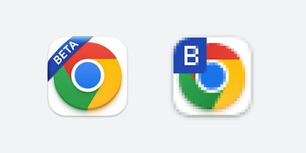
And one final little special feature: if you’ve installed a Chrome beta on your iPhone or iPad via TestFlight, you’ll get a very unique icon: «On iOS, our Beta app will start using a blueprint-like design, as a nod to Apple’s developer-focused apps.»
Chrome has a new icon. What do you think of it?
The competition has ended.
Journalist. Author. Hacker. A storyteller searching for boundaries, secrets and taboos – putting the world to paper. Not because I can but because I can’t not.
Interesting facts about products, behind-the-scenes looks at manufacturers and deep-dives on interesting people.
Show all